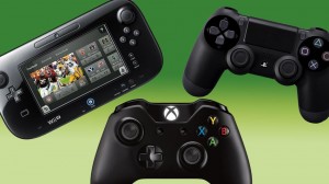
Hello again, dearest reader(s), I know I maybe promised a certain topic in last week’s article but due to extenuating circumstances (i.e., I forgot) I have instead prepared a different topic this week. It has been an ongoing discussion ever since the launch of the next gen systems, in which I do include the Wii U, about the controllers accompanying said systems. For the most part the consoles only offer an iterative difference in control, but sometimes even the slightest change can be a big issue when concerning the sole device used for interfacing with the console. So here I would like to look over some of the more recent controller designs and weigh them against the current offerings by the three major console manufacturers.
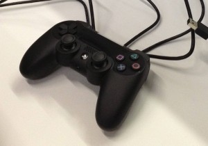
When I first came up with the idea for this article some time back I was unsure how I would include a perspective on either the PS4 or Xbone controller since I do not own either console. Well fortuitously enough, my old 360 pad I use for my PC decided to develop a faulty connection so I was in need of another. Interested in an upgrade at the same time, I went to a local Gamestop and asked for the Xbone controller since I knew it recently gained full PC driver support. However the clerk informed me that, not only does the PS4 controller also work with PC games but the controller comes sold with a USB wire. Neither of those things are exactly true. With no wire and far from full support for the PS4’s DualShock 4 (although it did work with Shovel Knight), it became pretty clear the clerk was a tad misinformed. However I took the opportunity I now had before exchanging the device for an Xbone controller to sample some of the PS4’s design and see how comfortable I could get with the new form factor and layout.
The PS4 controller was pretty nice to hold compared to previous Sony controllers which I found serviceable but a little lacking in the grip department. This time around the controller grips are very pronounced and nicely rounded for dummies like me who like big easy grips. The primary face button layout for all of Sony’s controllers has never changed much, ostensibly being the SNES diamond layout but with an extra set of shoulder buttons and two analogue sticks on the bottom. It serves as a nice blank slate that any game can fit in to and has proven itself a fine design over the last seventeen years on the market. I did not get a chance to use the touch pad or motion sensors since I was not using it with a PS4, but I can guess I would not be overly thrilled with either of those components. In most of my games the clickable touch pad served as a big center button, which is OK if a bit awkward to actually press. The new trigger buttons are a nice improvement from the rounded mushy triggers of the PS3 and the analogue sticks now have a lip around the edge, no longer being a simple flat matte surface. Additionally the d-pad has been improved over the mostly untouched design in previous PS controllers, wherein all the directional buttons had a lot of space between them making it somewhat difficult to move on a diagonal in 2D isometric games compared to other d-pads. The PS4’s d-pad is closer together now and, while the buttons are broader, there is less space between them and so pressing two directions as once is easier. My biggest gripe aside from the gimmicky touch pad and sensor light is with the other two center buttons, the Start and Share buttons. Never mind that the Share button is dumb and gimmicky in itself, the buttons themselves are pretty poorly designed. They are set into the controller flush with the case so they do not stick out at all. This makes pushing them or even finding them without looking is harder than it should be. When trying it out in Final Fantasy XIV, where the Start button is used frequently to access menus, it became a continued annoyance. I suppose I could have mapped the menu button to something else, but if I were playing a console game I probably would not have that option.
So a little dissatisfied with the controller design but very dissatisfied with the PC compatibility of the PS4 controller, despite knowing better beforehand, I returned to the store to swap it out for an Xbone controller. This one also did not come with a USB cable but I already had an extra in the house. I took it home, downloaded the nice official drivers from the manufacturer and not some controller wrapper that masks it as a 360 pad, and tested out Microsoft’s latest offering. After a short while I concluded that, out of all the terrible things MS thought up originally for the Xbone, that the controller was not one of their terrible ideas. It operates and feels very similar to a 360 pad with little exception. The analogue sticks now have rough edges for grip, I can only assume, which I could see serving more as an annoyance to some. I feel like they are an upgrade over the 360’s sticks despite the weird addition mostly because the sticks feel much more accurate and with a smaller deadzone. The triggers have also undergone a curious change, one that I am also indifferent to, wherein the ends of the trigger curve upward. Again, the idea of helping to keep fingers from slipping off is nice, but it may be a case of over-thinking the design. Thankfully neither of these examples of superfluity got in my way, which allows the greatest improvement offered by this controller to really shine: a working d-pad. It seems like little to ask of a controller to have a nice d-pad as even Nintendo, the originators of the thing, has messed it up. And Nintendo’s lock on the design should have faded some nine years ago when their patent on it expired, yet still only suboptimal imitations were produced until recently. This gen all three console makers seem to have gotten the right idea with the d-pad, and the Xbone’s is as fine and straightforward as it can get. It is exactly a d-pad, as it should be, without any weird alterations to the idea. As well, and something I also remain (mostly) indifferent to is the unaligned placement of the analogue sticks. Sony’s bottom alignment and MS’s asymmetrical design both work well for me but I have heard hard opinions favoring one over the other.
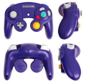
Now, I say “mostly” the placement does not matter to me because in the case of Nintendo’s top aligned sticks it seems to bother me. I cannot truly place the why of it, but especially on the Pro Controller I have a weird time adjusting to the face buttons being bellow the stick instead of above it. Perhaps it will come with more playtime since admittedly I have only used it for Wind Waker and Mario 3D World. That aside, Nintendo has produced yet another major shakeup with its primary controller design and, once again, is relying on a multitude of controller options for their console. It is a continuing oddity and source of confusion, mostly likely for the casual consumer that needed to be informed that the Wii U was not a tablet peripheral for the Wii, as to why Nintendo feels the need to reinvent the wheel when it is precisely that penchant that locks them out of better third party support for core titles. Well, without getting into that any more, the so called Gamepad for the Wii U is actually a fine controller. The mammoth size of the device is no problem at all, as I had initially feared, and the button layout is very simple and effective. With a well sized d-pad, unlike the GameCube’s, and with nice concave triggers and depressable analogue sticks, Nintendo has designed a pretty solid controller around the tablet they stuck in the middle of it. The + and – buttons are a bit too out of the way, and the face buttons are smaller and farther a part than I would prefer, but it all works well enough. The separately sold Wii U Pro Controller is also a fine design, putting the + and – buttons well within reach and providing nice but simple trigger buttons. Baring the aforementioned analogue stick placement, the Pro Controller is an excellent way of avoiding draining your Gamepad’s short battery life and of providing a tighter button layout. Despite setting many of the current controller design trends, Nintendo has been the least apt to stick to them and not always for the better. And while I recognize the shortfalls of some of their experiments with other layouts, (Lusipurr, I get it. The GameCube’s controller is not perfect but I still love it) there is usually some good to be found in all of their console control offerings.
So, in what was a great surprise to me, I have produced a very very long ramble about controllers. And the only thing that I could possibly add to it at this point is a simple plead to add your own thoughts to this deuce-worthy compendium of the various controllers on the market today. What is your preferred method of control? What is the worst (psst, it should probably be the Dreamcast)? Extra points for typing in your response on a console browser using a game controller. (Yeah right)


